SpoedMarktplaats Design System
One source of truth for a marketplace that had none.

Alejah Sardiniola
available for work
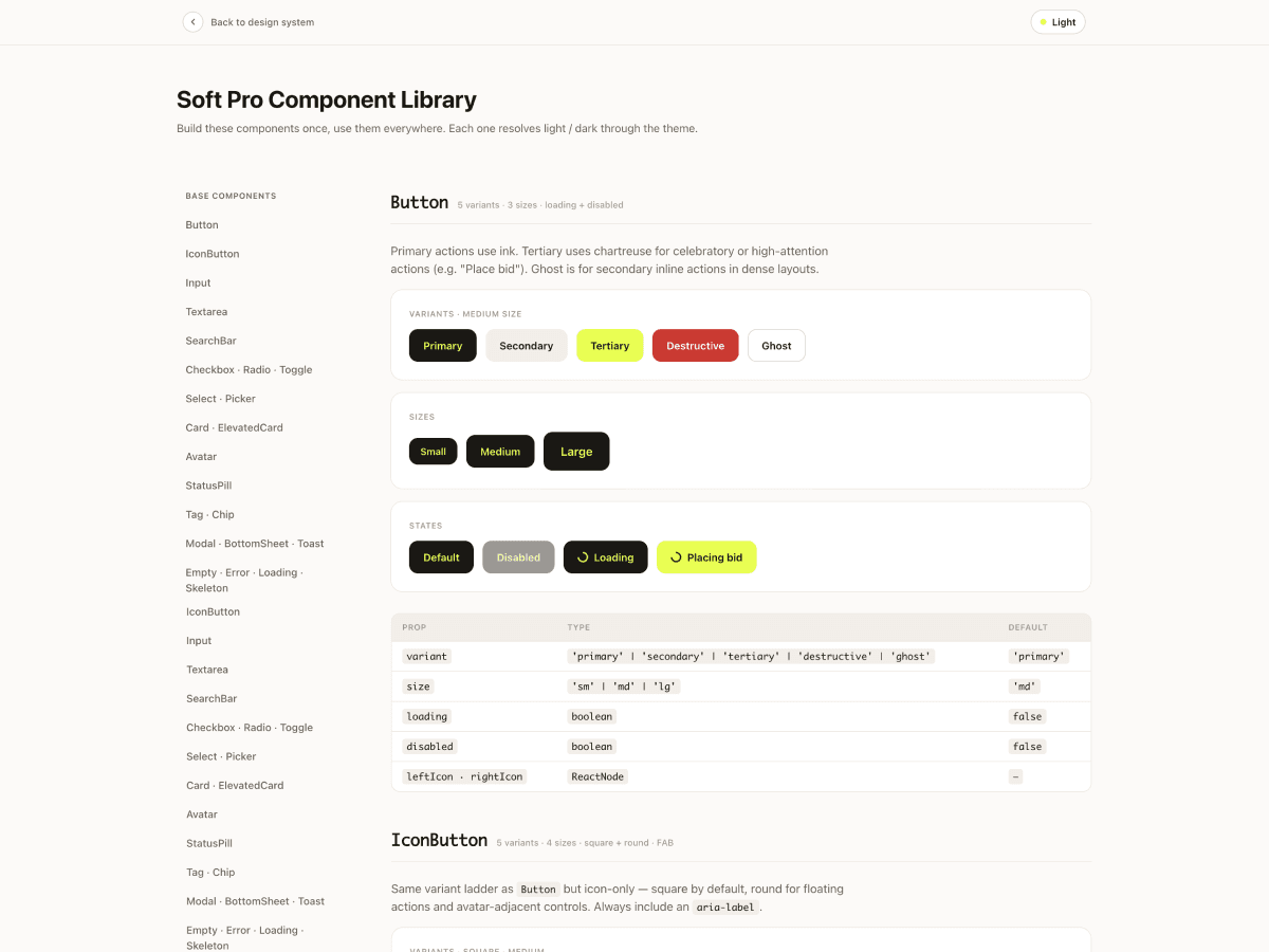
SpoedMarktplaats connects people to tradespeople — plumbers, electricians, roofers — when something breaks and the clock is running. The app already existed. It already had users. What it didn't have was a system. I built one: a semantic, light + dark, token-driven foundation extracted straight from the screens already in production, then rebuilt the entire surface on top of it. Primitives, semantic color roles, spacing, radii, typography, shadows, and motion — all of it as typed TypeScript constants. One file. One source of truth.
The problem
The solution
What was built
- Token-driven foundation in a single tokens.ts — primitives → semantic roles → components
- Full light + dark theming that resolves from shared semantic tokens, no duplicated styles
- Complete color audit extracted from 52 live production screens
- 4px spacing grid with semantic insets and gap aliases for consistent rhythm
- iOS-grade type scale (SF Pro), 7-step ink-tinted shadow system, and motion tokens
- Signature components: UrgencyTimer that shifts color as a job nears expiry, JobCard, BidCard
- Trade-specific system: SectorPill, FsBadge verification, BoostFlame for paid boosts
- Documented showcase site — screen inventory, redesigned mockups, component library, token report
Tech stack
Impact
The app went from 52 one-off screens to one system that drives all of them. Dark mode stopped being a liability and started being free. New features now start from tokens instead of guesses — which means they ship faster and look like they belong. The client got more than a fresh coat of paint. They got the thing that should have existed before the first screen was ever built: a foundation that holds.
Reflections
Here's what this project hammered home: a design system isn't decoration you add at the end. It's the strategy you should have started with. The client didn't have an ugly app — they had an unstructured one, and structure is what users actually feel. The real work wasn't picking prettier colors. It was making one decision once, naming it, and never having to make it again. Build the system first. Everything after moves at the speed of it.